
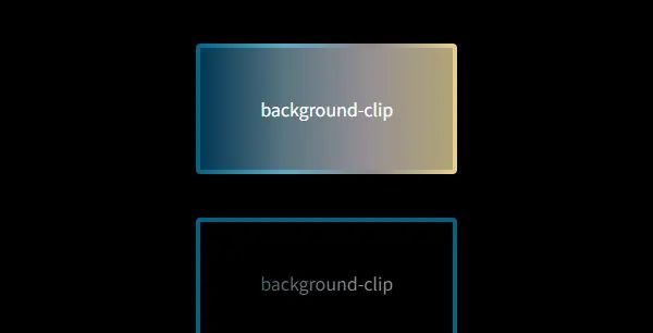
background-clip
文档
https://developer.mozilla.org/zh-CN/docs/Web/CSS/background-clip
示例
HTML
<div class="demo border">background-clip</div>
<div class="demo text">background-clip</div>
CSS
.demo {
  display: flex;
  justify-content: center;
  align-items: center;
  width: 240px;
  height: 120px;
  border-radius: 4px;
  border-width: 4px;
  border-style: solid;
}

.border {
  border-color: transparent;
  background:
    linear-gradient(90deg, #003755, #597581, #969094, #b1a477) padding-box,
    linear-gradient(90deg, #006484, #5aacc4, #8e888a, #e9d18b) border-box;
  color: #fff;
}

.text {
  border-color: #006484;
  background-image: linear-gradient(90deg, #003755, #597581, #969094, #b1a477);
  background-clip: text;
  color: transparent;
}
结果
© 版权声明
文章版权归作者所有,未经允许请勿转载。如内容涉嫌侵权,请在本页底部进入<联系我们>进行举报投诉!
THE END


暂无评论内容