
盒子模型
1.盒子模型2.网页布局方式浮动浮动的三大特性
定位相对定位绝对定位固定定位
标准流Flexbox和Grid(自适应布局)
1.盒子模型
CSS 中的盒子模型(Box Model)是用于描述 HTML 元素在页面中如何布局和占据空间的模型。每个 HTML 元素都被视为一个矩形的“盒子”
CSS盒模型中的内边距(padding)和外边距(margin)是两个重要概念:
内边距 (padding)
定义: 元素内容与边框之间的空间
作用: 控制元素内容与其边框的距离
特点: 背景色会延伸到padding区域
外边距 (margin)
定义: 元素边框与其他元素之间的空间
作用: 控制元素与其他元素的距离
特点: 背景色不会延伸到margin区域
直观图解
<!--盒子模型
   margin:外边距
   padding:内边距
   border:边框
   content:内容
   width:宽度
   height:高度
-->

┌─────────────────────────────────────┐
│              margin                 │
│  ┌───────────────────────────────┐  │
│  │           border              │  │
│  │  ┌─────────────────────────┐  │  │
│  │  │        padding          │  │  │
│  │  │  ┌───────────────────┐  │  │  │
│  │  │  │      content      │  │  │  │
│  │  │  └───────────────────┘  │  │  │
│  │  └─────────────────────────┘  │  │
│  └───────────────────────────────┘  │
└─────────────────────────────────────┘
详细的代码示例
<!DOCTYPE html>
<html lang="en">
<head>
<meta charset="UTF-8">
<meta name="viewport" content="width=device-width, initial-scale=1.0">
<title>盒子模型</title>
<style>
.demo {
/* 设置背景颜色为水蓝色 */
background-color: aqua;
/* 设置为行内块元素,既有块元素特性又不独占一行 */
display: inline-block;
/* 设置内容区域宽度为50像素 */
width: 50px;
/* 设置内容区域高度为50像素 */
height: 50px;
/* 设置内边距为30像素(四边相同) */
padding: 30px;
/* 设置外边距为10像素(四边相同) */
margin: 10px;
/* 设置边框:10像素宽的蓝色实线边框 */
border: 10px solid blue;
}
.border-demo {
/* 设置为行内块元素 */
display: inline-block;
/* 设置背景颜色为绿色(RGB值) */
background-color: rgb(16, 213, 68);
/* 设置内边距为30像素(四边相同) */
padding: 30px;
/* 设置内容区域宽度为100像素 */
width: 100px;
/* 设置内容区域高度为100像素 */
height: 100px;
/* 设置四种不同样式的边框:上(虚线)右(实线)下(点线)左(双线) */
border-style: dashed solid dotted double;
/* 设置所有边框颜色为蓝紫色 */
border-color: blueviolet;
/* 设置四边不同的边框宽度:上(10px)右(30px)下(5px)左(3px) */
border-width: 10px 30px 5px 3px;
/* 注释掉的代码:单独设置左边框为20像素宽的蓝色实线 */
/* 单独给左边框设置
border-left: 20px solid blue; */
}
</style>
</head>
<body>
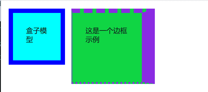
<div class="demo">盒子模型</div>
<div class="border-demo">
这是一个边框示例
</div>
</body>
</html>
在网页上的效果
2.网页布局方式
浮动
可以根据开发者的意愿,漂浮在网页的任意方向
浮动相对于父元素浮动,再回在父元素内部移动
浮动的三大特性
脱标:脱离标准流
一行显示,顶部对齐
具备行内块元素特性
使用float可以实现浮动设置
先看一下正常的代码
<!DOCTYPE html>
<html lang="en">

<head>
    <meta charset="UTF-8">
    <meta name="viewport" content="width=device-width, initial-scale=1.0">
    <title>浮动</title>
    <style>
        .father {
            /* width: 500px; */
            height: 150px;
            background-color: red;
        }

        .left-son {
            width: 100px;
            height: 100px;
           background-color: green;
            /* float: left; */
        }

        .right-son {
            width: 100px;
            height: 100px;
            background-color: yellow;
        }
    </style>

    </style>
</head>

<body>
    <div class="father">
        <div class="left-son">左浮动</div>
        <div class="right-son">右浮动</div>
    </div>
</body>

</html>
网页显示为

将样式中的left-son和right-son分别添加左右浮动后的效果
 <style>
        .father {
            /* width: 500px; */
            height: 150px;
            background-color: red;
        }

        .left-son {
            width: 100px;
            height: 100px;
            background-color: green;
            float: left;
        }

        .right-son {
            width: 100px;
            height: 100px;
            background-color: yellow;
            float: right;
        }
    </style>
![图片[1] - Web_CSS 盒子模型以及布局方式 - 鹿快](https://img.lukuai.com/blogimg/20251122/42894bdbc1b8468d846d43565edf3052.png)
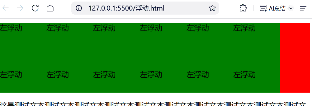
如果遇到下面这种情况就会出现问题,因为左浮动的内容过多会超出父级,导致测试文本显示出现问题
<body>
    <div class="father">
        <div class="left-son">左浮动</div>
        <div class="left-son">左浮动</div>
        <div class="left-son">左浮动</div>
        <div class="left-son">左浮动</div>
        <div class="left-son">左浮动</div>
        <div class="left-son">左浮动</div>
        <div class="left-son">左浮动</div>
        <div class="left-son">左浮动</div>
        <div class="left-son">左浮动</div>
        <div class="left-son">左浮动</div>
        <div class="left-son">左浮动</div>
        <div class="left-son">左浮动</div>
        <div class="left-son">左浮动</div>
        <div class="left-son">左浮动</div>
        <div class="right-son">右浮动</div>
    </div>
    <p>这是测试文本测试文本测试文本测试文本测试文本测试文本测试文本测试文本测试文本测试文本测试文本测试文本测试文本测试文本测试文本测试文本测试文本测试文本测试文本</p>
</body>
![图片[2] - Web_CSS 盒子模型以及布局方式 - 鹿快](https://img.lukuai.com/blogimg/20251122/459f88cdff844ba0a66c936cf1faf651.png)
这时候我们可以通过对左右浮动父级使用 overflow: hidden;来解决这个问题
   .father {
            /* width: 500px; */
            height: 150px;
            background-color: red;
            overflow: hidden;
        }
定位
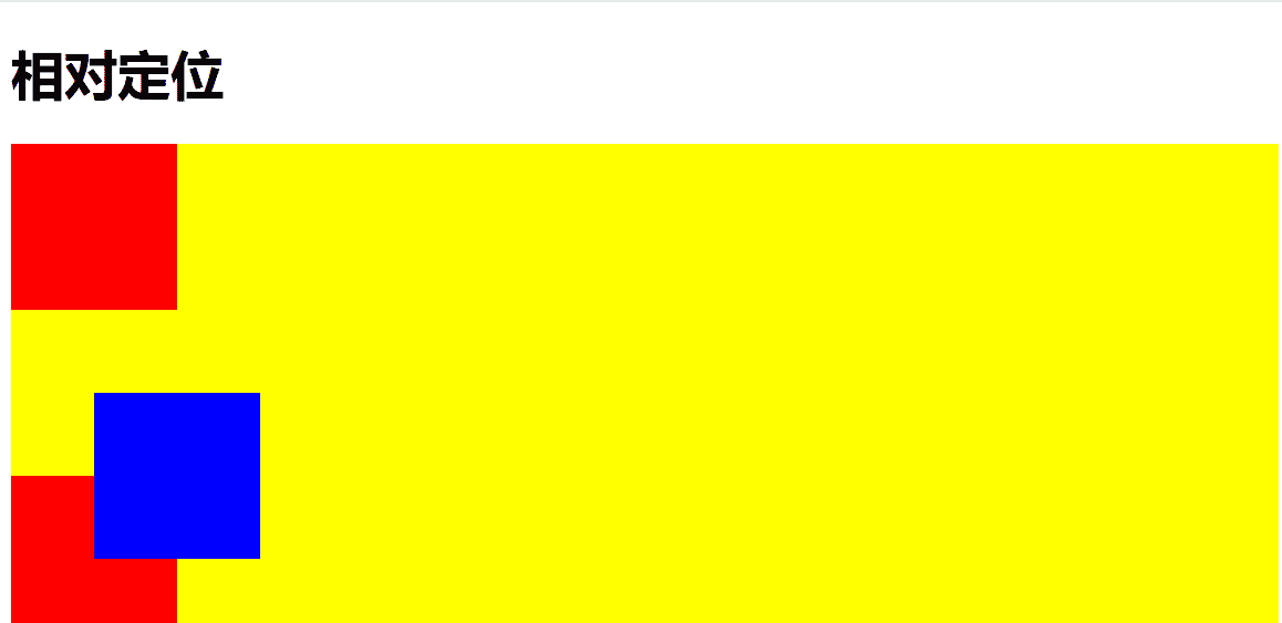
相对定位
元素相对于其正常位置进行偏移
特点:
元素仍占据原来的空间(不影响其他元素布局)
使用 top、bottom、left、right 相对于自身原始位置移动
不脱离文档流
设置类名为box-relative元素的位置,用背景色来作为参考
<!DOCTYPE html>
<html lang="en">

<head>
    <meta charset="UTF-8">
    <meta name="viewport" content="width=device-width, initial-scale=1.0">
    <title>定位</title>
    <style>
        .box1 {
            height: 350px;
            background-color: yellow;
        }

        .box-normal {
            width: 100px;
            height: 100px;
            background-color: red;
            left: 50px;
        }

        .box-relative {
            width: 100px;
            height: 100px;
            background-color: blue;
            /* 设置为相对定位 */
            position: relative;
            /* 设置左右上下位置 */
            left: 50px;
            right: 100px;
            top: 50px;
            bottom: 20px;

        }
    </style>
</head>

<body>
    <h1>相对定位</h1>
    <div class="box1">
        <div class="box-normal"></div>
        <div class="box-relative"></div>
        <div class="box-normal"></div>
    </div>

</body>

</html>
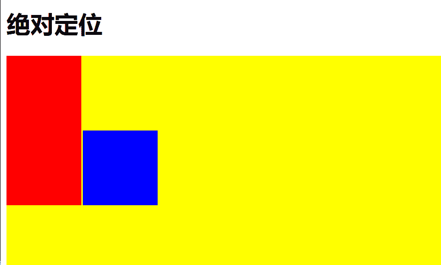
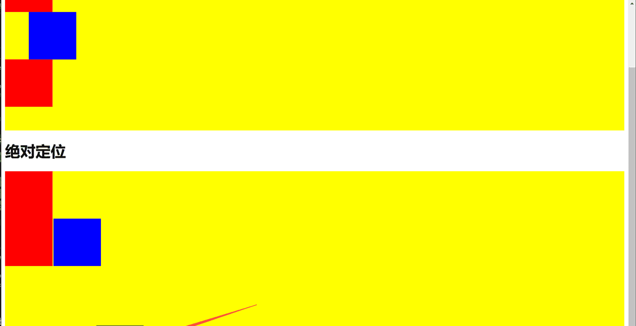
绝对定位
元素相对于最近的已定位祖先元素进行定位
特点:
元素脱离文档流,不占据空间
如果没有已定位的祖先元素,则相对于 html 元素定位
使用 top、bottom、left、right 相对于定位上下文移动
在body中添加
  <h1>绝对定位</h1>
    <div class="box2">
        <div class="box-normal"></div>
        <div class="box-absolute"></div>
        <div class="box-normal"></div>
    </div>
在style中的代码
 <style>
        .box2 {
            height: 350px;
            background-color: yellow
        }

        .box-absolute {
            width: 100px;
            height: 100px;
            background-color: blue;
            /* 设置为绝对定位 */
            position: absolute;
            /* 设置左右上下位置 */
            left: 110px;
            /* top: 0px; */
            /* right: 100px; */
        }
    </style>
固定定位
元素相对于浏览器视口(viewport)进行定位,不随页面滚动而移动
主要特点:
元素完全脱离文档流,不占据空间
始终相对于浏览器窗口定位
页面滚动时位置保持不变(”固定”在屏幕上)
在body中添加
    <h1>固定定位</h1>
    <div class="box-fixed"></div>
在style中的代码
 <style>
     .box-fixed {
            width: 100px;
            height: 100px;
            background-color: green;
            /* 设置为绝对定位 */
            position: fixed;
            /* 绝对定位的元素,默认是相对于视口定位的 */
            /* 设置左右上下位置 */
            left: 200px;
            bottom: 10px;

        }
    </style>
一直固定在下方不会跟随页面滑动而改变位置
标准流
网页按照元素的书写顺序一次排列
Flexbox和Grid(自适应布局)
Flexbox 是一种一维布局模型,用于在主轴方向上排列项目,适合处理一维布局(行或列)。
Grid 是二维布局系统,可以同时控制行和列,适合复杂的网页布局。


暂无评论内容